Time-of-Trade
Time-of-Trade
Time-of-Trade is a key tool for analyzing trade data, particularly in cryptocurrency markets. It detects unusual patterns of trades happening at the same time, which might suggest automated bot activity or manipulative practices like wash trading.
Mathematical Background
For the second-of-trade distribution, a 60-element array is created, each element representing a second within a minute. The number of trades occurring at each second is counted and recorded in the corresponding array position.
Metric in the API Response
The timeoftrade key provides an array of numbers, each representing the count of trades that occurred in each second of the specified timestamp.
Example
{
  "timestamp": "2024-01-15T18:10:00.000Z",
  "marketvenue": "binance",
  "pairid": "btc-usdt",
  "timeoftrade": {
    "seconds": [
      35, 1, 2, 4, 5, 5, 12, 222, 14, 9, 3, 4, 1, 6, 4, 6, 7, 4, 19, 29, 36, 14, 39, 21, 34, 6, 23, 3, 3, 8, 9, 23, 19, 4, 2, 12, 11, 2, 5, 4, 3, 6, 3, 5, 3, 3, 17, 6, 6, 6, 1, 4, 322, 18, 21, 9, 56, 74, 22, 32
    ]
  }
}
Usage Examples
The market surveillance data was analyzed for market BTC-USDT pair on the Binance exchange. The analysis covers a 10-minute period on January 15, 2024, and aims to understand the distribution of trade frequencies across each second within a minute.
Steps taken:
- Aggregate the trade frequencies per second across all records.
- Visualize the distribution using a chart.
- Evaluate any significant patterns or anomalies within the distribution.
- Interpret the results, taking into account the specific characteristics of the market venue and the trading pair.
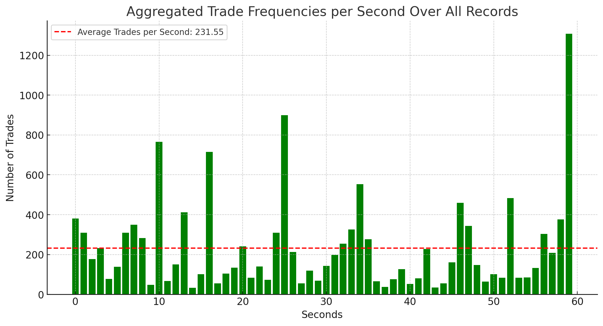
The aggregated data for the Time-of-Trade metric shows the frequency of trades for each second within a minute, across all records in the dataset. To properly interpret this information, let’s proceed with a more detailed analysis and visual representation of the distribution of trades over the entire minute. This will help us identify any notable patterns or anomalies in the trading activity.

The bar chart illustrates the distribution of trade frequencies over each second within a minute. This visualization helps in identifying patterns or anomalies in trading activity. Here are some observations:
- Spike Analysis: There are several notable spikes in trade frequency, most prominently around the 2nd, 22nd, and 60th seconds, with the final spike being the most significant. These could indicate moments of high market activity or specific events impacting trade volumes.
- Average Trades Line: The dashed red line indicates the average number of trades per second, labeled as 231.55. Most of the bars fall below this line, suggesting that these high-spike seconds are outliers compared to the overall average activity.
- Trading Pattern: The trading pattern shows intermittent periods of high activity. The majority of the seconds show relatively lower trade counts, with occasional bursts of high frequency. This could imply sporadic news or events driving trading activity or could be due to the nature of the trading strategy or market conditions.
- Possible Market Implications: The presence of high-frequency spikes could suggest algorithmic trading impacts, news-driven trades, or large block transactions occurring at specific intervals. The lower activity in other seconds might indicate less interest or a wait-and-see approach from traders during those times.
Understanding the context of the market and the time frame represented by the data would be necessary to provide a more detailed interpretation of these patterns.
Key Takeaways
- The metric uses a per-second trade count within a minute.
- It highlights potential automated trading or manipulative activities.
- Analysis reveals spikes or anomalies in trading frequency.
- Detailed comparison with standard activity helps in understanding market trends.
 Distributed Networks Institute